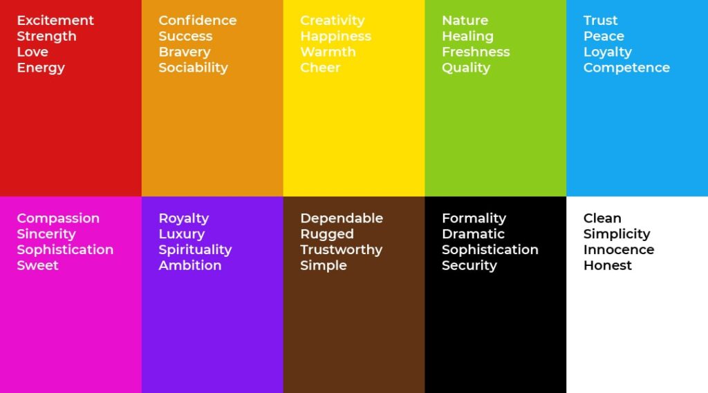
Colours affect us. Inevitably, when we see a dress, a logo, or an object in a specific colour, we associate it with something concrete. Red implies love, green hope, and blue loyalty. These meanings vary across cultures. For example, in Europe, white symbolises purity and innocence and is used for bridal gowns at weddings. Even in Ancient Egypt and Rome, priestesses wore white to signify purity. In many religious rituals, priests also wear white.
Your company has an image, and it’s represented by your logo. Choosing the right shade is crucial because it will be the first message your potential customers receive. That’s why we’re going to discuss the psychology of colour and the meanings behind different colours.
What is the psychology of colour?
The psychology of colour is a field of study focused on determining the effects that colours have on us, so we can understand how they influence our decisions.
Specifically, it’s not about whether one shade matches another, but rather understanding what lies behind each particular colour. That is, what meaning it holds for us. These meanings can be influenced by culture, tradition, or personal experiences.
For this reason, it’s helpful to understand everything about colours so that we can make a stronger first impression on customers when they see our logo.
The meaning of colours
As mentioned earlier, white represents purity. On the other hand, its opposite, black, signifies sadness. However, it’s interesting to note that in some Asian countries, it’s quite the opposite: while we wear black for funerals, in China or Korea, white is used. Yellow represents gold and wealth. We associate red with passion, but in South Africa, it’s the colour of funerals. In India, love is represented by yellow.

The choice of colours for brand advertising, logos, and other visible symbols must be made carefully, especially if you have a business selling in other countries. As you can see, it may be necessary to adapt your strategy depending on the region.
The effect of colours on us
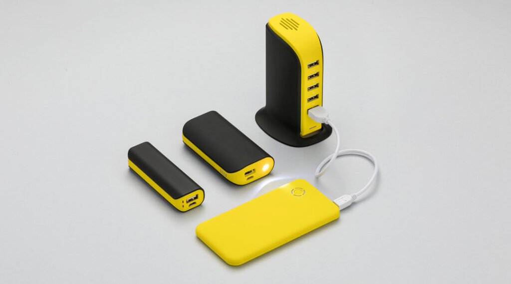
Colours can evoke both positive and negative emotions. Most businesses align their identity with one or a very limited number of colours. As experts in promotional gifts, we recommend paying attention to this, as it’s not just about the logo itself but also the object you choose and its material. To help, here’s a guide on logos.
The psychology of colour examines how these colours influence feelings and behaviour. The perception of colours is important in terms of evolutionary biology, as our ancestors used them to detect potential dangers, and this awareness has been passed down through generations, becoming ingrained in our culture.
Without further ado, let’s explain the meanings of the most common colours, so you can make the best choice for your brand’s image.
Red: not just a symbol of love
Blushing from embarrassment, showing someone the red card… Red shouldn’t just be associated with love and passion. It’s a warm colour, but also ideal for signalling. Red tells us to stop at traffic lights and is often used in signs to indicate prohibition.
It can also be very attention-grabbing, or conversely, symbolise anger and aggression. In business, we all remember Nescafé’s red mugs or Nestlé’s red box, showing that red can go beyond its traditional meaning and be used, especially, to attract attention.
Yellow: warm and positive
Yellow, like the sun, egg yolk, yellow emojis, sunflowers… This colour expresses happiness, joy, and fun. It’s perfect for conveying enthusiasm. Yellow environments suggest a productive atmosphere.

By promoting optimism, it’s ideal for brands like BIC or McDonald’s, whose logos we know by heart, as they aim for this effect. If you want to create a similar impression with your personalised merchandise, you might choose a shade like this.
Orange: a cheerful colour
A mix of red and yellow, orange radiates light and warmth. Orange brightens the mood and conveys happiness and confidence. It can also represent adventure and risk-taking.

Orange tones can have a positive impact in both workspaces and home environments. When selecting corporate gifts, you’ll find plenty of options in this vibrant colour. Additionally, consider wooden alternatives, which can convey a connection to nature.
Speaking of companies, the company Orange is a prime example of a brand whose identity is perfectly reflected in its name and colour.
Green: calming and refreshing
As you may know, green is associated with nature and life, and of course, hope. These colours are particularly soothing, and the human eye perceives them positively. It also represents freshness and vitality, making it perfect for companies involved in the food industry.

A notable example is McDonald’s, which changed its logo from red to green to reflect these values in consumers’ minds. If you’re considering sustainable merchandise, this colour could be ideal.
Blue: calming effect
Blue, like the sky or the sea—two spaces we often associate with relaxation. A clear sky or the sound of a calm sea can be perfect for this. Darker shades of blue can be associated with formality, professionalism, and even security.
Forbes, Visa, Ford, LinkedIn, HP… many companies use this colour to convey these values, and interestingly, it’s common in sectors such as insurance, finance, or technology.
What’s your preference when it comes to colours for your logo? Do you have a favourite shade? Leave your comments below—we’d love to hear from you!